Sean O'Toole
Conversion-focused website copywriter.
Clarity connoisseur. 💎
Get website copy they’ll actually understand
Let a Webby-winning conversion geek clarify your copy, so everything you say just clicks.Because no one should leave your site not knowing why you’re wonderful.

Get carefully designed copy from a strategic-minded expert, not some dingus who “likes to write”
Rely on a "voice of customer" research process that’s rooted in their words, not our whims
Walk away with polished Figma wireframes that say what you need them to say
“This type of talent is extremely rare.”
-Kathy Svetina, Founder of NewCastle Finance
It's simple.
You're looking at this.
Your copy isn't clicking
Low conversion
High bounce / poor site engagement
Confused or bad-fit leads
Nagging sense you’re not getting through
Plus maybe just for fun...
You've got an
extra clarity challenge
Unfamiliar / complex product
Multiple audiences / use cases
Early awareness prospects
Crowded market where it's hard to differentiate
But then I do stuff like this.
>> Conversion audits>> Landing page copy>> Full website rewrites
Unbury the value
Put in more problem
Say it their way
Use proof to prove things
Define the transformation
Match their "job to be done"
Dimensionalize the benefits
Get organized
Get specific
Break it into beats
Make headers work harder
Remove uncertainty
Teach why it's true
Pick a fight
Make it sticky
Leave in the dangerous thing you want to delete
Cut the fluff
Add the missing piece
Simplify, simplify
So you can do this.
Clarify your message.
Build a cohesive case that distracted, doubt-filled readers understand and believe.
Lift conversion.
Turn more of your current visitors into informed and qualified customers.
Make growth easier.
Acquisition, retention, sales velocity. Everything gets simpler when your site is a customer factory.
And in the end...
Bad things go down...
CAC
Bounce
Churn
Dread
Good things go up...
Conversion rate
ROAS
LTV
Bliss
...and we celebrate with rare sodas.

Right on, soda is delicious business goals are important
Did we not meet earlier?
Hi, hello, I'm Sean.
I’ve written $10 million email sequences for Groupon, hundreds of jokes for The Onion, and this plucky little website just for you.I used to think the #1 thing copy should do is “cut through the noise” by being clever or kooky or, bless my heart, “bold.”

Now I worry less about how your copy sounds
and more about what it’s saying.
Here's what that looks like in practice.
See how I sharpen a story
(Even a complicated one that's already confusing everybody.)
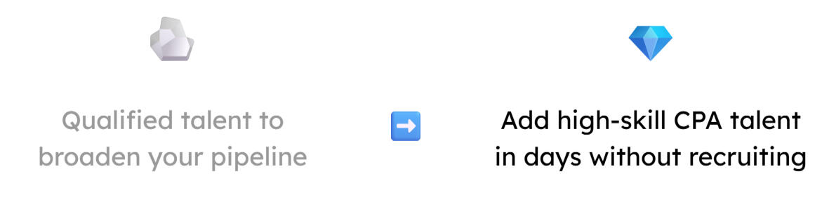
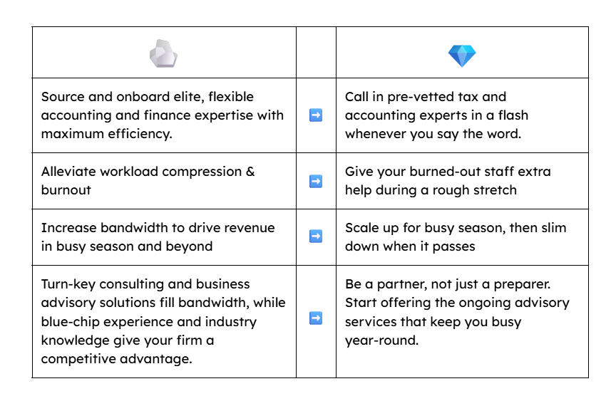
Staff Augmentation
sales page
Drawing out the hidden narrative from a hasty placeholder page

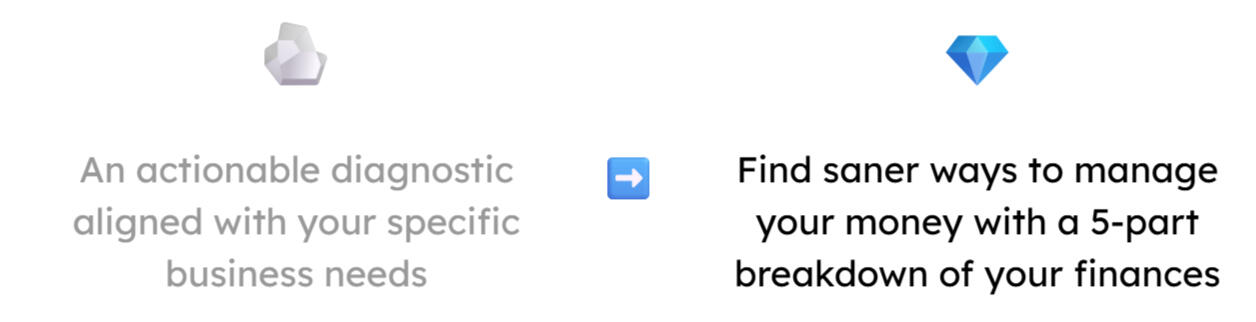
Financial Health Check
sales page
Turning a bare-bones service description into a pitch you're proud to share

I can explain.
Call in a copywriter who can make your message click.Because nobody buys things they don’t even understand.
Website Conversion Project #1
Staff Augmentation sales page for Paro
A rushed placeholder page turns into a sophisticated story grounded in the reader’s reality.

The company
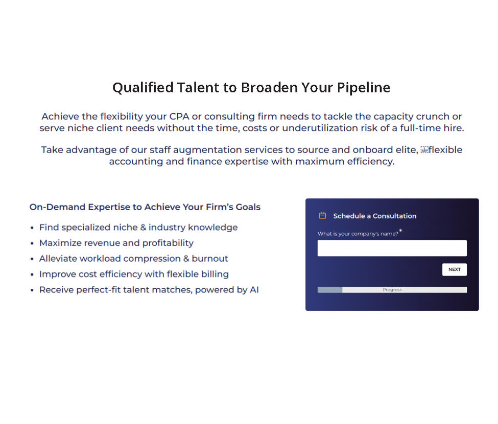
Paro is a talent-matching platform for companies looking for financial service providers. Think Upwork for tax and accounting pros, except with far stricter vetting and with the matching done for you.
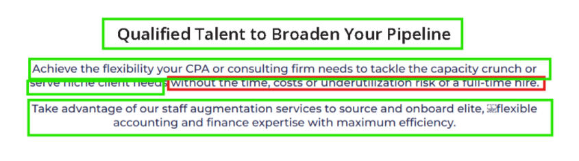
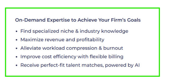
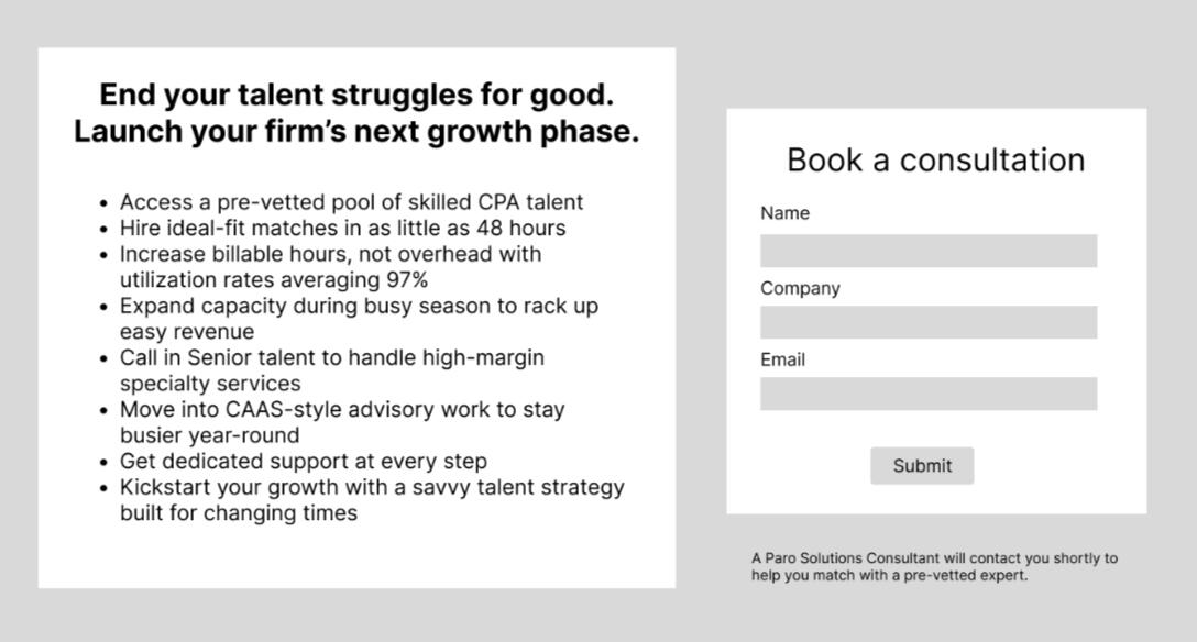
The offer
Staff augmentation is Paro’s short-term “white labeling” service for CPA firms. You might use it to bring on extra help during tax season, or to find specialists to handle tricky client requests.
⚠️ Clarity risks ⚠️
Multiple audiences & use cases.
Staff aug is a handy tool for small, midsize, and large firms—but all for different reasons.High stakes.
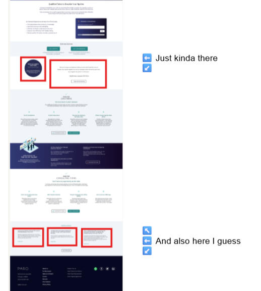
To a small CPA firm, adding staff is downright scary. That makes ambiguity extra dangerous: leave cracks in our case, and fear will seep in.Existing "minimum viable" page.
It made sense to launch this service with a "good enough" placeholder page. But we couldn't get locked into its arbitrary message decisions. It needed a teardown, not a tweak.
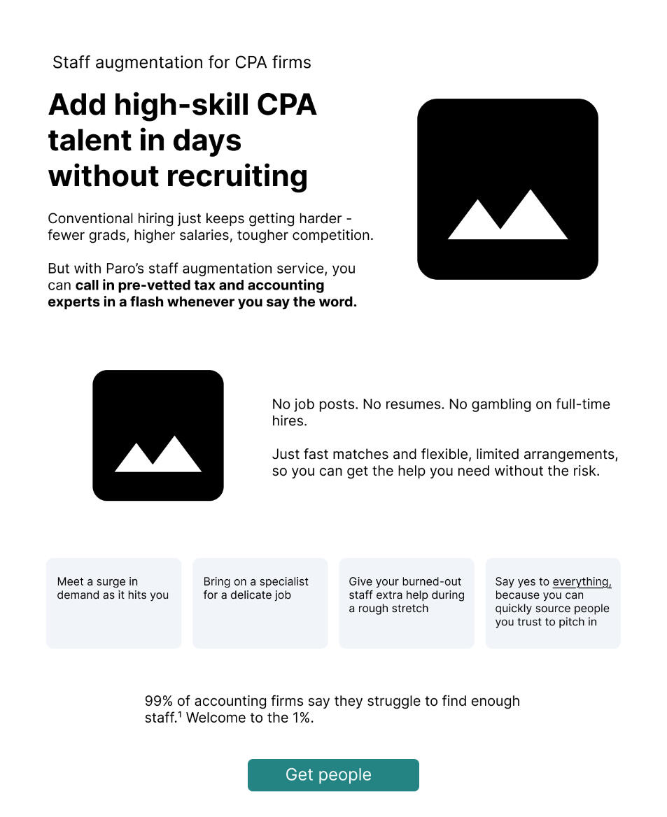
Before
Jumbled organization
Clumsy phrasing and jargon
Missing crucial context (especially "problem" & "use case")
Half-hearted proof, dropped in at random
After
Intuitive flow: first orients you, then deepens the narrative
Direct, conversational language
Concrete use cases you can instantly recognize
Powerful quotes & stats that support clear points
Put me to work
Website Conversion Project #2
"Financial Health Check" sales page for NewCastle Finance
A bare-bones service description becomes a persuasive case for how this 3-week audit can transform your business.
The offer
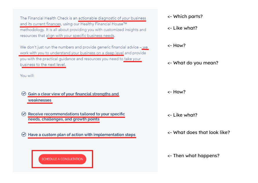
The Financial Health Check is a systematic scan of how your small business manages money, performed by a CFO. It helps you uncover the root causes of your confusion, so you can make better-informed decisions and avoid costly mistakes.
⚠️ Clarity risks ⚠️
Complex offer. This audit checks for dozens of issues across 5 distinct categories. The page needs to do justice to that scope without overloading you with info.High stakes. A $10,000 price tag isn’t intimidating for the right client. But a lengthy dive into their books might be. We’ll need a tidy case to earn that kind of access.Low awareness & sophistication. The small businesses that most need this service often don’t realize how broken their financial systems really are. So before we can sell them the solution, we’ve got to spell out their problem, in simple terms that make sense to a newcomer.
Before
Vague language hides all the benefits
No indication who it’s for or why you’d need it
Lack of detail scares you off
Virtually no proof

The complete original

After
Clear value prop and vivid problem statement
Specific pain points so you know if you're a fit
In-depth look at the process to reduce fear
Sharp testimonials that back specific claims

Hero section only


Put me to work
Featured
Website conversion projects
Project #1
"Staff Augmentation" sales page
Drawing out the hidden narrative from a hasty placeholder page

Project #2
"Financial Health Check" sales page
Turning a bare-bones service description into a pitch worth showing off

Heads up, the best stuff is up there. ⬆️
But yes, in truth, there is more.
Ok, fine, here you go.
Bonus Samples
Here are some other things you might want me to tackle while I’m sprucing up your site.Because who wants to hire two writers for one job?
Bonus Samples
Emails and blog content
Email strategy & copywriting
Groupon Select launch
We wanted to convince Groupon users to join a new premium membership program. But first, we had to solve a dilemma.
Long-form content writing
Charity ratings guide (3,500-word blog post)

Our sophisticated readers loved details, but existing articles on this topic were all paper-thin. So we went the other way with it.
Headline writing
Collected article headline edits

A closer look at a special skill I’ve always had a knack for. (And one people keep asking me to do.)
Gallery of Wonders
Social posts, banner ads, and assorted curiosities


Put me to work
You're building something great.
I can prove it.
Fill in the form to get started. I'll respond within 1 business day.
You can also message me here:
[email protected]
Sean O'Toole
Conversion-focused website copywriter.
Clarity connoisseur. 💎
Yuh-oh, your copy's looking pretty confusing.Click through to make me clear it up.

Where we're starting 🪨

1) Unbury the value

2) Put in more problem

3) Say it their way

4) Use proof to prove things

The final product 💎


From clunky to clear

Compare before & after

Well looky there, we nailed it! Seems like we work pretty well together...
Meet the guy you just did that with

Sean O'Toole
In the game since 2010
Early hire at Groupon (and got to see the rise and fall)
200+ hrs. of Copyhackers and CXL conversion training
Two Webby Awards for Best Copywriting, zero friends who are impressed by that
Clearly Better
6 big ways I solved this page's clarity problems
1) Say it their way
Replace jargon and fluff with more natural language.
2) Put in more problem
Begin at the beginning: the reader's current pain points. That way the benefits stand out more in contrast.
❌ Not like this
All outcomes, no pain points. It's like only telling the end of the story.
✅ Like this
Adding the pain makes the benefit clearer. It helps you see the difference, as they say.
3) Get organized
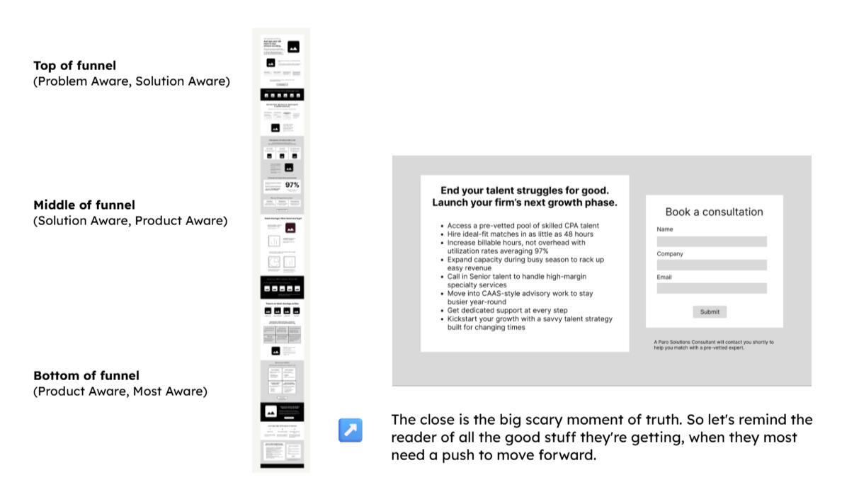
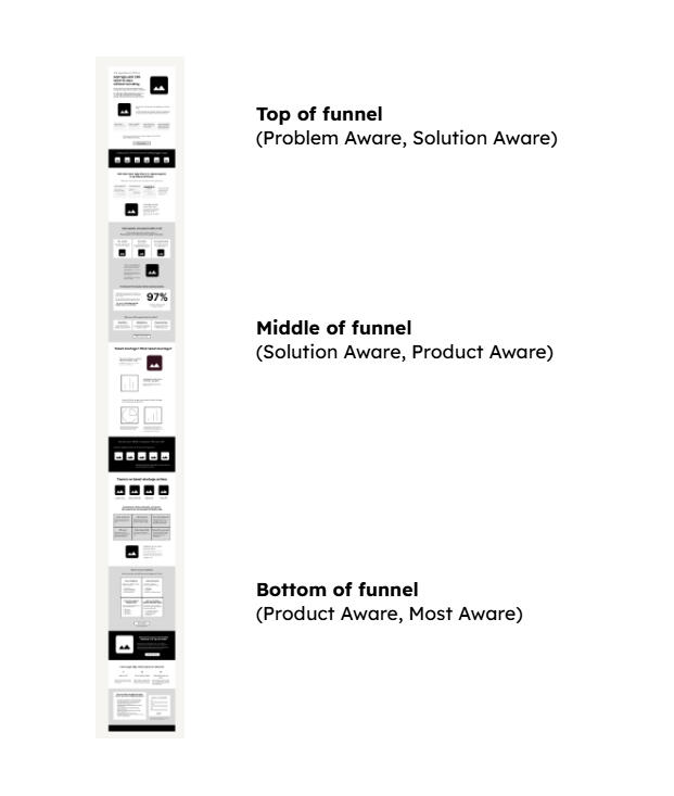
Restructure the page to move readers through the “stages of awareness.” Then close with a strong call to action that sums it all up.
4) Make headers work harder
Use headers that frame each section’s main point. That way even skimmers still get the idea at a glance.
❌ Not like this
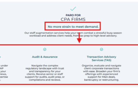
What’s the connection between “No more strain to meet demand” and the skill menu? I don’t know!
✅ Like this
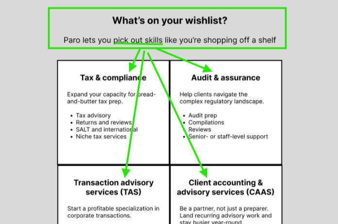
Same details, different header to frame them. And now the point is unmistakeable.
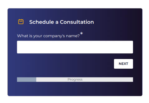
5) Remove uncertainty
Customers hate not knowing what to expect. Show them exactly what happens when they say yes, so they feel comfortable taking the next step.
❌ Not like this
But, like, then what happens? How does this whole thing even work? Forget it, it's lunchtime, I'm out.
✅ Like this
More specific = less scary. Don’t leave room for doubt.
6) Use proof to prove things
Don’t just sprinkle proof points all over like Lawry’s. Position them like concrete pillars wherever your case needs support.
❌ Not like this
Poor, lost little proof puppies, roaming the page in search of a purpose
✅ Like this
Claim and proof, moving in tandem like tango partners
❌ Not like this
✅ Like this

Hero section


Hero section

The close is the big scary moment of truth. So let's remind the reader of all the good stuff they're getting.

❌ Not like this

But, like, then what happens? And how does this whole thing even work?
✅ Like this
More specific = less scary. Don’t leave room for doubt.
Suggested soundtrack
"Don't Let Me Be Misunderstood"
by Santa Esmeralda
Clearly Better
4 big ways I solved this page's clarity problems
1) Define the transformation
Determine how to frame the big change you deliver for customers. (Ideally by getting them talking!)
Dodging a message disaster
You might assume the value of advice from a CFO is a no-brainer: it helps you become more profitable.But the funny thing is, that's not what past clients told us they loved about this audit. Like, at all.
❌ Wrong promise: Practical
"Grow your profits"
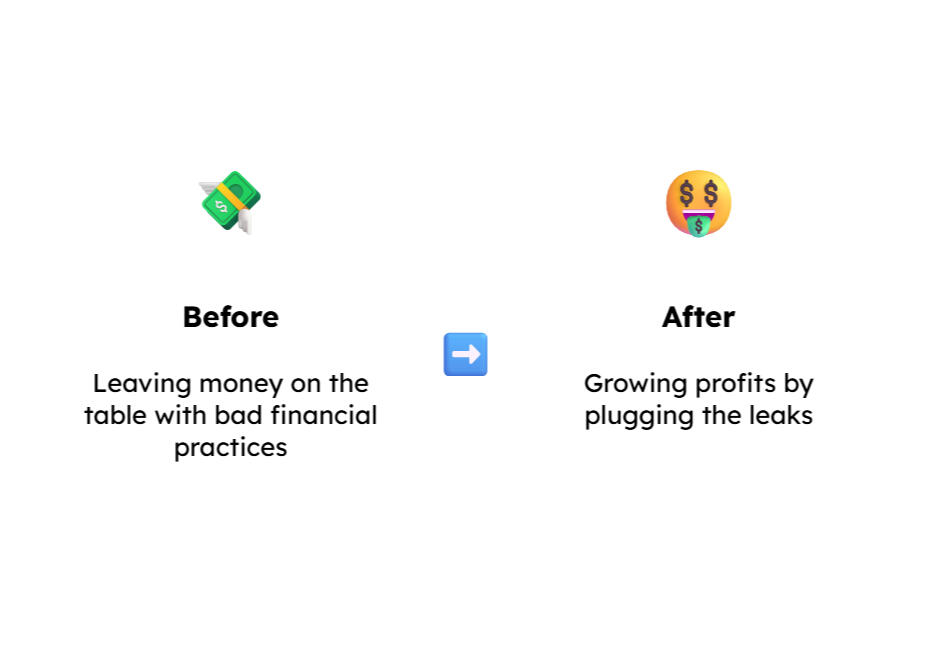
✅ Right promise: Personal
"Feel in control of your finances"
A tricky case: the obvious message would have landed with a thud
How did we make this discovery? Easy. We interviewed clients about their experience, then studied their language for patterns.
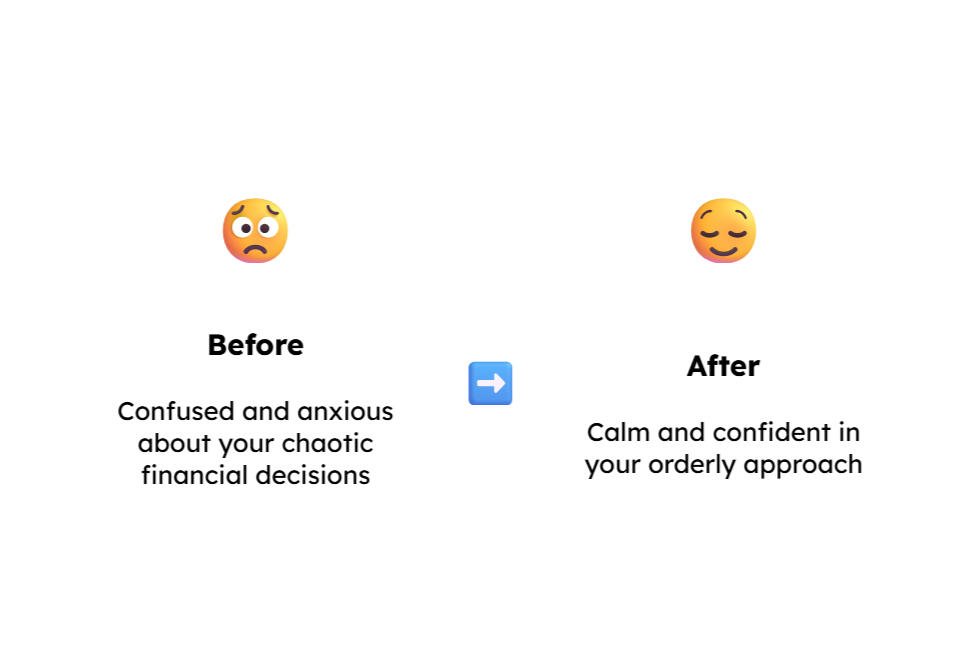
Their "before" state:
Confusion
“I could never understand, why am I profitable but I have no money?”“I had all this cash, yet it scared the crap out of me every day.”“Most of the time, I have no idea what the **** I'm doing, and I just figure it out as I go.”
You know your interview is going well when people stop being polite and start getting real. Curse words are a great sign!
You know your interview is going well when the curse words start flying. You don't want ---, you want real.
Their "after" state:
Calm
“She just really elevated my consciousness and confidence.”“She's calming. She just has a great way about her.”“I can be kind of catastrophizing, like, oh, my God. And she's like, no. Let's look at the facts.”
From confusion to calm: interviews revealed the true transformation.
By listening carefully to our audience, we uncovered crucial emotional benefits that would have been easy to ignore.With our transformation worked out, it was time to tell the story.
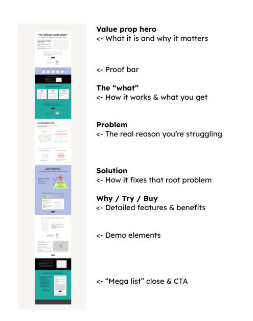
Message discipline, in 16 screenshots
Here’s how I threaded the transformation (“confusion to calm”) throughout the page.The result: a single cohesive message that’s impossible to miss. This is what it looks like to get your story straight.


Confusion and calm, threaded throughout the page
2) Get organized
Arrange your story in a logical order that anticipates what readers want to know next.
3) Get specific
Replace abstract phrases with concrete details, so readers know what you're really talking about.
❌ Not like this
Vague statements leave clients wondering what they're in for.
✅ Like this
So many more specifics. So much safer to say yes.
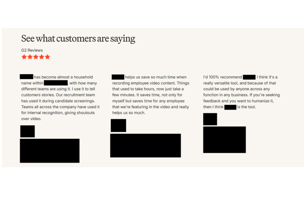
4) Use proof to prove things
Skip the generic "what they're saying" section. Place testimonials strategically to enhance your argument.
❌ Not like this
The typical way to present testimonials (via another site). Lots of text, but what's the takeaway?
✅ Like this
The clear way to present testimonials: use them to support your claims.
❌ Not like this

Vague statements leave clients wondering what they're in for.
✅ Like this
So many more specifics. So much safer to say yes.
If you didn’t know any better, you might assume the value of this financial audit is a no-brainer: it helps you make more money.
But we knew that “better results” weren’t the deep-down thing clients loved about this service. The real value was something far more personal for business owners: feeling less anxious about their finances.

Suggested soundtrack
"Don't Let Me Be Misunderstood" by Santa Esmeralda
Secret Sample Stash: The Onion 🔒
Due to the strict ethical standards of fake journalism blah blah blah
Lift conversion
📈
Get more leads and sales from the audience you already have.
Improve lead quality
🤝
Attract better fits who need less persuading because they already get it.
Cut acquisition costs
💲
Higher conversion = lower CAC. (That’s just math.)
Your copy isn't clicking
Low conversion
High bounce / poor site engagement
Confused or bad-fit leads
Nagging sense you’re not getting through
Plus maybe...
You've got an extra clarity challenge
Unfamiliar product
Multiple audiences
Jargon-prone industry
Crowded market where you need to differentiate aggressively
⚠️ Clarity risks ⚠️
Multiple audiences & use cases.
Staff aug is a handy tool for small, midsize, and large firms—but all for different reasons.High stakes.
To a small CPA firm, adding staff is scary. That makes unanswered questions extra dangerous: leave cracks in our case, and fear will seep in.Existing "minimum viable" page.
Paro was growing quickly, so it made sense to launch this service with a "good enough" placeholder page. But we couldn't get locked into its arbitrary message and layout decisions. This page needed a teardown, not a tweak.
Before
Jumbled organization
Clumsy phrasing and jargon
Missing crucial context (especially "problem" & "use case")
Half-hearted proof, dropped in at random

After
Intuitive flow: first orients you, then deepens the narrative
Direct, conversational language
Concrete use cases you can instantly recognize
Powerful quotes & stats that support clear points

Clarity risks ⚠️
Complex offer. This audit checks for dozens of issues across 5 distinct categories. The page needs to do justice to that scope without overloading you with info.High stakes. A $10,000 price tag isn’t intimidating for the right client. But a 3-week dive into their books might be. We’ll need a tidy case to earn that kind of access.Low awareness & sophistication. The small businesses that most need this service often don’t realize how broken their financial systems really are. So before we can sell them the solution, we’ve got to spell out their problem, in simple terms that make sense to a newcomer.
Tap to polish